Project details:
Architect: Studio KO (Olivier Marty & Karl Fournier)
Location: Marrakesh, Morocco
Construction: 2015 – 2017
Scale: 3549 sqm
Client: Fondation Pierre Bergé – Yves Saint Laurent
Photographs: Chaimae Himdi
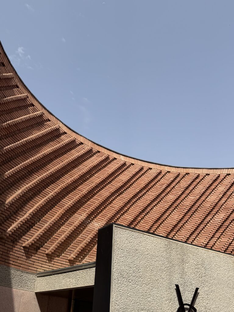
Studio KO’s Musée Yves Saint Laurent is easy to admire for its facade, its material choices, and its relationship to the city around it. What is less discussed is what happens once a visitor is inside and how the plan holds up against the confidence of the entry sequence. This piece takes both questions seriously, moving from the building’s concept to the lived experience of moving through it.
A contrast built into the envelope
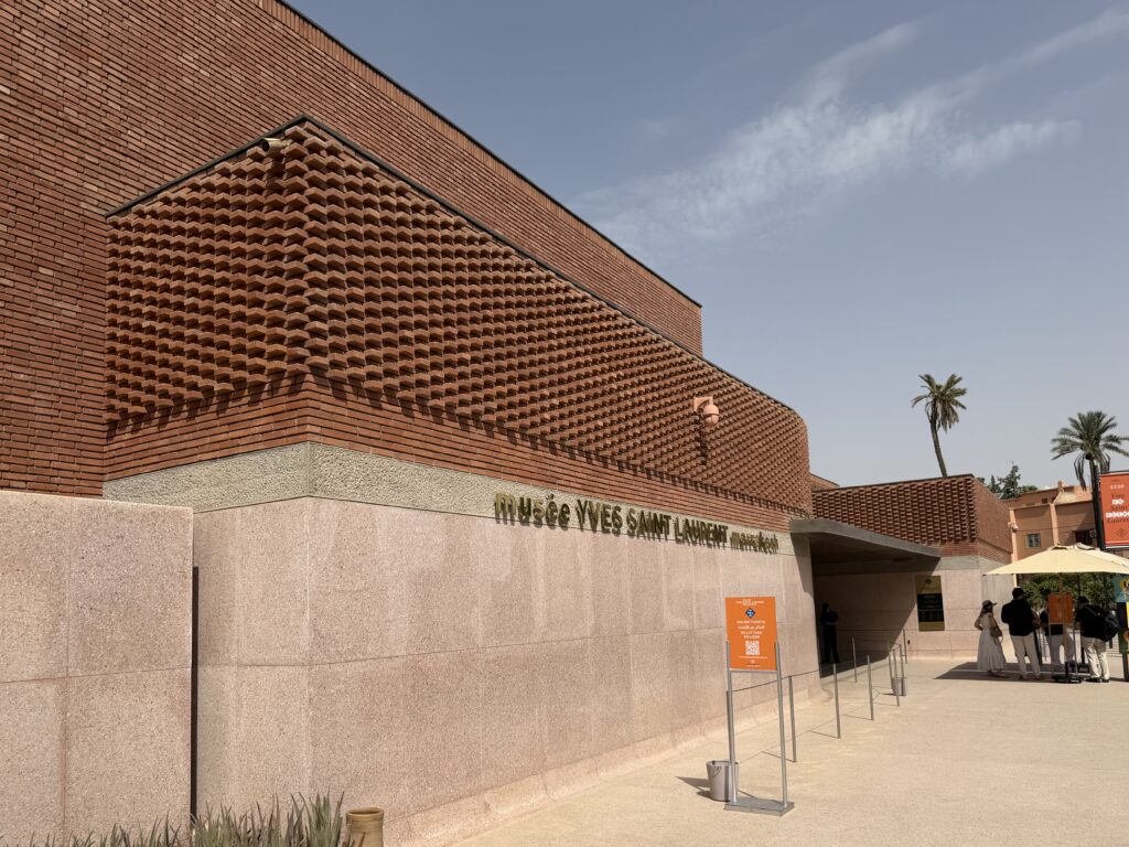
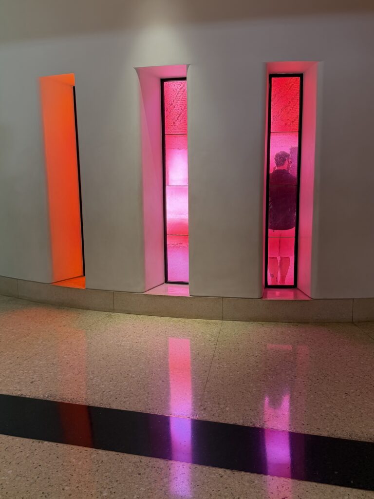
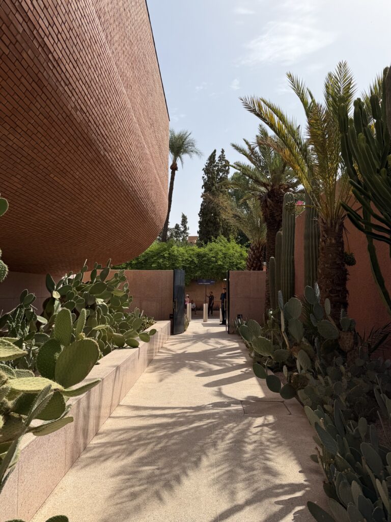
The museum presents itself as two distinct architectural statements fused at a single seam: an exterior that speaks the language of craft and climate and an interior that speaks the language of theater. This is the project’s deliberate rupture between skin and core, staged as a kind of garment: a textured, patterned exterior wrapping a smooth, radiant lining.
The facade is the building’s most legible argument. Clad in terracotta brick, laid in shifting patterns that read as weave rather than wall, it ties the museum to Marrakech. The brick is a material choice locally produced and hand-worked that lets the building sit in its context. This is where the concept shows: the architects chose to communicate with the surroundings through texture, tone, and craft process. To my eye, the result is a building that feels warm and situated on approach.
The interior does not extend the facade’s vocabulary; it contradicts it. Studio KO themselves frame this contrast deliberately, describing the interior as the lining of a couture jacket set against the textured shell of the exterior: velvety, smooth, and radiant where the facade is textured. In practice, that contrast is most absolute in the museum’s main exhibition space, built around theatrical accent lighting that references stage design. Still, the governing move is the one the architects name themselves: the building does not evolve from outside to inside; it breaks. The skin belongs to Marrakech; the core belongs to the exhibition.
Opacity as climate strategy
The facade’s opacity is a functional response to Marrakech’s climate, and this is where the building’s logic becomes easier to defend. A nearly windowless brick envelope is, first, a thermal strategy: mass and shade against a sun that makes conventional glazing untenable for a building tasked with preserving textile and paper archives.
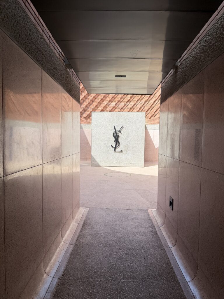
Two patios carry the weight of this argument. The exterior patio, circular, generous, sits at the geometric heart of the proejct: an outdoor room that draws light and air into the plan’s center without compromising the opacity of the perimeter. Beside it, the smaller interior patio, set within a tighter square courtyard near the boutique, repeats the gesture at a domestic scale, closer to the register of a riad courtyard than to a museum atrium.
A welcoming courtyard, a disorienting sequence
The entry sequence is, on its own terms, the strongest move in the plan. From the entrance porch, the visitor is drawn directly into the exterior patio. It is a confident piece of architecture: legible, welcoming, correctly scaled to ease a visitor from the street into the institution.
But the plan does not sustain that clarity past the patio. What follows is a sequence of enclosed rooms connected almost exclusively through single doors and airlocks, rather than through any shared visual or spatial field. No gallery announces the next; no function anticipates the one beside it. The building moves visitors through a chain of sealed boxes, and the patio, rather than remaining a constant point of reference throughout the visit, becomes instead a space you pass and then lose.
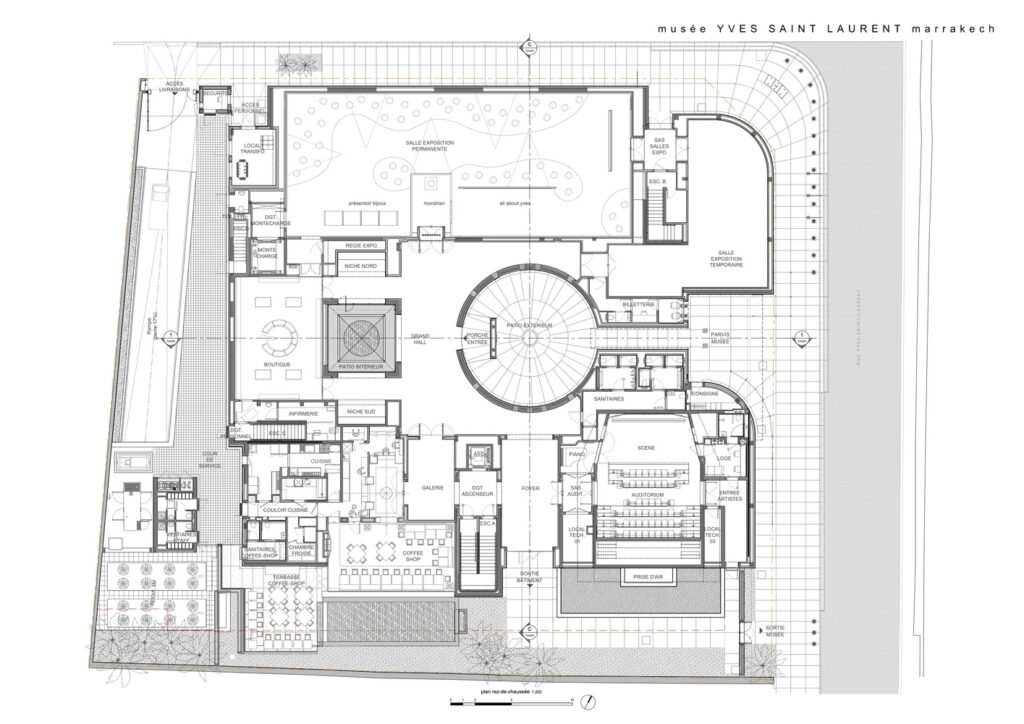
Concretely: from the exterior patio, the route turns right into the temporary exhibition hall first, then continues into the permanent exhibition hall (the long northern gallery). From there, a single door leads into the gift shop. Exit the shop, and the visitor is deposited back near the patio, but now approaching it from its left side, by the interior patio. It is a disorienting repetition: the same courtyard, reintroduced from an unfamiliar angle, with no spatial cue along the way to explain how the two moments connect. This is the minute of confusion, a lack of legible connective tissue between one room and the next. The remaining functions, the auditorium and the coffee shop, sit further south, reached the same way: door, corridor, door.
The contradiction, then, is internal to the plan itself. The entry sequence promises a building organized around a legible, generous heart: the patio as anchor. The gallery sequence delivers the opposite: a string of self-contained rooms in which the patio functions as a threshold rather than a spine you return to. The museum welcomes you brilliantly and then, almost immediately, asks you to navigate without the very element it used to draw you in.
This raises a broader question for museum architecture generally and for cultural buildings that foreground scenography in particular: how much should a visitor be expected to orient themselves through spatial cues, and how much can be delegated to signage, staff, or a floor plan handed out at the door? A building can make a legible argument about material and climate and still leave the visitor to navigate its interior largely on their own. Whether that is a deliberate curatorial choice (treating disorientation as part of the experience, the way a scenographer might withhold a clear sightline on purpose) or simply an unresolved plan is a question this visit alone cannot settle. But it is worth asking of any museum that treats its interior as a sequence of reveals rather than a legible route: at what point does the theatrical replace the wayfinding a public building still owes the people inside it?